Glenn Innes Underpass Mural
Context
This project was created as part of my studies at yoobee colleges. We were tasked with bringing colour to an otherwise drab and lacking space.
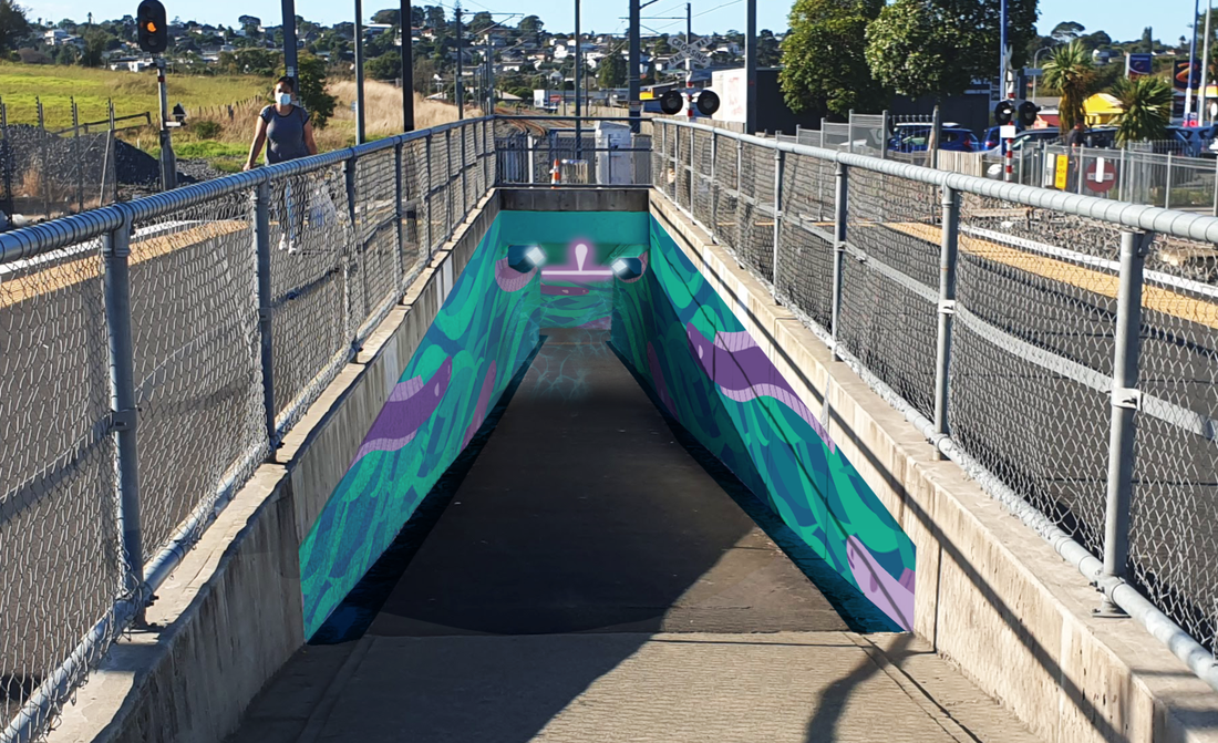
Auckland has a network of trains transporting people around the city. At several locations, underpasses have been created for pedestrians to cross safely underneath the tracks. However, these tunnels are often narrow, poorly-lit, passages that feel unsafe to enter or pass through. I decided to bring both light and colour into the tunnels to make them feel safer to pass through, and also to discourage anti-social, destructive, or aggresssive behaviour. I wanted the tunnel’s artwork to connect in some way to the area’s history or culture. I chose the Glenn Innes Underpass for my demonstration, and I worked on this project for two weeks in February 2022.
This project was created as part of my studies at yoobee colleges. We were tasked with bringing colour to an otherwise drab and lacking space.
Auckland has a network of trains transporting people around the city. At several locations, underpasses have been created for pedestrians to cross safely underneath the tracks. However, these tunnels are often narrow, poorly-lit, passages that feel unsafe to enter or pass through. I decided to bring both light and colour into the tunnels to make them feel safer to pass through, and also to discourage anti-social, destructive, or aggresssive behaviour. I wanted the tunnel’s artwork to connect in some way to the area’s history or culture. I chose the Glenn Innes Underpass for my demonstration, and I worked on this project for two weeks in February 2022.


Concept Development
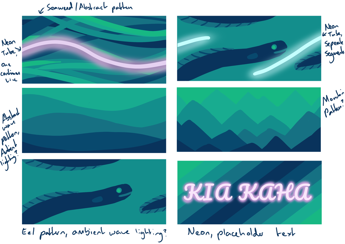
In the early 1700s, Glenn Innes was home to a thriving Māori population thought to be in the tens of thousands. The peninsula was a rich, prosperous area, with 2000 hectares of Kumara Gardens. The rivers and beaches were also bountiful food gathering sights providing seafood and the delicacy smoked Eel.
The artwork created in the tunnel will be a nod to the area’s history and the Māori iwi’s connection to Eels.
Colour Theory
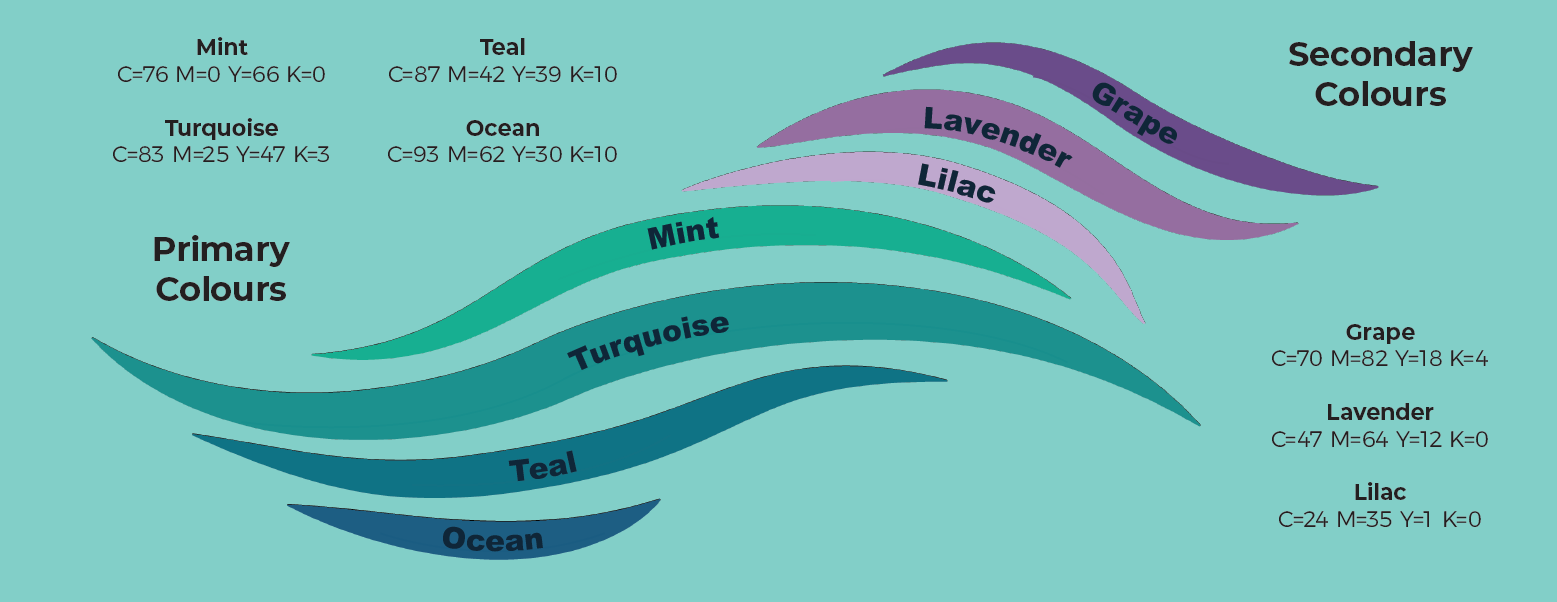
An important aspect of this project was colour choice. I choose to use a harmonious mixture of cool blues and light greens with pops of purple as an accent colour.
The purpose of the artpiece is to create a calming, safe space, so I went with a predominatly blue palette. Blue is a tranquil, soothing colour which invokes feelings of trust and peace. As the tunnel is already a small, dark space, I predominantly used the mid to light range of blues and turquoises to keep the space feeling light and open. Mint green is another soothing colour, and feels reminiscent of nature. The darker blues and mint green were used sparingly to keep the focus on the soothing, core blues.
As the tunnel as themed as an underwater eel hideaway, the blues and greens I choose were reminiscent of water, rivers, and seaweed. The soft lilacs and lavenders were used as a contrast colour to add more interest and energy while still remaining calming and soothing overall.
For the light, I wanted a rippling effect, like sunlight over water. I used a very bright, light blue light to emphasise the calming, underwater atmosphere while also bring light into the space to make it feel safer and easier to see.
|
|
Mock Ups
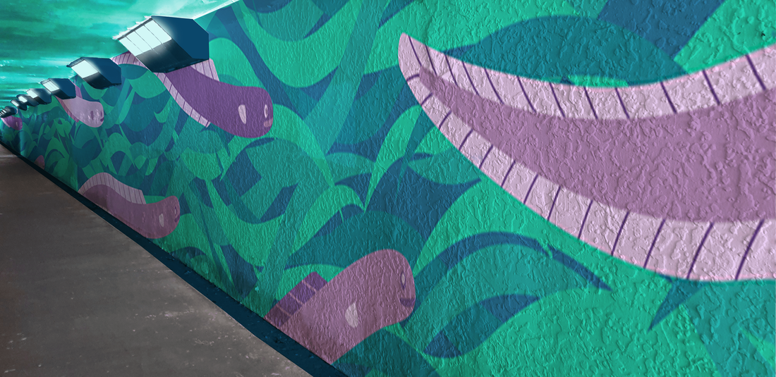
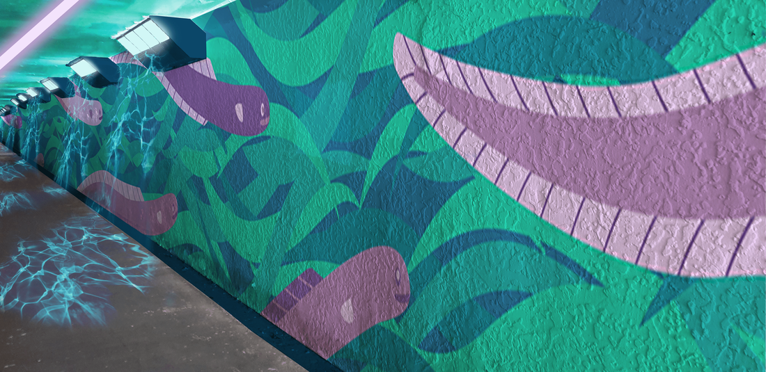
I created some mockups to demonstrate what the mural would like like installed in the space. I wanted to show the effect that the light and colour would have on the dark, unsafe tunnel. It makes it much brighter, more fun, and more attractive and safe feeling. I created these mockups in photoshop, using photos that I had taken and my own artwork.
Software Skills
I used Adobe Photoshop for drafting concepts and creating mockups. I used Adobe Illustrator to create the high-quality vector graphics for the mural, so that it would be scaleable and look good at different sizes. I also used Adobe InDesign to create an accompanying document for grading.
